Blog Blurb

Blog Blurb


a matter of urban light is a design blog with the aim of exhibiting truly inspirational projects in landscape architecture and lighting within the urban environment. This blog will be created in tangent with my third year study of landscape architecture at Kingston University in London with the aim of hopefully moving into a career based on lighting in landscape architecture and the built environment.


i Hope the Blog is useful and interesting.


Aaron Carpenter


“Lighting design goes one step further, Setting moods and radiating aspirations.” Clare Lowther and Sarah Schultz


Precedents

Precedents

Sunday 30 January 2011

Edward Burtynsky Manufactured Landscapes


Images sourced from http://www.edwardburtynsky.com/index.html

“We come from nature so we must not harm it as we will only end up harming our selves.” Edward Burtynsky

Manufactured Landscapes is a documentary observing the photographer Edward Burtynsky as he explores China’s industrialization. Manufactured Landscapes depicts the industrialization of China in a surreal and scary way but Edward Burtynsky manages to paint a beautiful picture of the horrors of industrialization with his photography. The film goes through many stages and processes of manufacturing from large scale factories, recycling of computer components in China and ships in India, large scale metropolises to the worlds largest dam the Three Gorges Dam located in the Yangtze River. The dam is 5 times wider than the Hoover Dam in the U.S.

The film really shows the ugly side of China’s growth. 13 cities were demolished by the owners them selves who were paid by the government to allow for the completion of the Three Gorges Dam. This is to allow clear access for the bottom of ships clearing any obstructions. The fourth image shows the demolition of a city. China’s ethic in this film seems to be the destruction of tradition to allow the construction of the high rise contemporary metropolis. The fifth image shows alone house belonging to an elderly lady who didn't want to move for the developers so they merely demolished everything around her except her home which is left standing in amongst the rumble.

The main theme from this video is that industrialization is clearly not a good thing for the environment. Not just in China but for the rest of the world. China was used for the subject of the film as its growth is unprecedented. After Mao’s rule had ended in 1959 China contained 90% rural areas and 10% urban whilst in the modern day or at least when this film was made china was 70% urban and 30% rural. We live in an uncomfortable bubble at the moment where we can see the worlds changing but we don't want to change. Its not as simple as right or wrong it needs a whole new way of thinking.

“I look at the industrial landscape as a way of defining who we are. Its part of our politics and economy; it is a landscape but its a different landscape.” Edward Burtynsky
Friday 28 January 2011

Exit Through The Gift Shop


Exit Through the Gift Shop a Banksy Film is a slightly deceiving title as the film really doesn't concentrate upon the antics of Banksy. But if I am honest it was a pleasant surprise when I sat down to watch this and realized the film actually followed the obsessed ammeter “film maker” Thierry Guetta who found himself involved with the rise of street art through his cousin known as Invader in amongst Paris’s streets. This is when Thierry meets another big name of street art Shephard Fairey (OBEY) via his cousin Invader when working with him in Los Angeles.

Basically Thierry becomes the man every street artist wants around them to film and help out; with the understanding that all of Thierry’s footage will become the first street art film. Eventually Thierry meets Banksy who asks to see the final film. “I was faced with that terrible thing, when somebody shows you their work and everything about it is shit... so... you don't really know where to start.” Banksy. This is the point when everyone realizes he cant actually produce a film and he is merely an enthusiastic camera man.

Whilst Banksy helps create Exit Through the Gift Shop using Thierry’s footage he suggest to him to do some of his own art, which Thierry goes of to do with enthusiasm and puts his efforts in creating one of the biggest street art exhibitions under the name Mr Brainwash in Los Angeles, convincing everyone he is the next big thing despite his work looking like everyone else's.

This is a great watch and Thierry makes you feel like you can achieve anything if you put your mind towards it; and as along as you have his endless enthusiasm and energy.

“Uhmmm... You know... it was at that point that I realized that maybe Thierry wasn't actually a film maker, and he was maybe just someone with mental problems who happened to have a camera.” Banksy

Thursday 27 January 2011

National Portrait Gallery Taylor Wessing Prize

Huntress with a Buck by David Chancellor


Tic Tac and Tootsie by Jeffrey Stockbridge


Merel by Clare Shilland


Images sourced from
http://www.bbc.co.uk/news/entertainment-arts-11721591


The National Portrait Gallery is currently hosting the Taylor Wessing Photographic Portrait Prize winning entries. The competition had a lot of entries I think it was well over six thousand. The exhibition contains sixty contemporary photos taken by amateurs and professionals of all ages and backgrounds. The photos within the exhibition have all been taken by the artists whilst exploring some really interesting themes.

The top image is of the winning entry by David Chancellor entitled Huntress with a Buck. This image does conjure up the feeling of it being a great photography shot but then again I am struggling to understand the appeal to it that obviously the judges saw. I had the same feeling with many of the images within the exhibition they all seemed a little cliched with similar subjects and themes. All the images had been taken beautifully but my main criticism would be that they didn't feel original or shocking enough.

The Gallery Farringdon Arts and Architecture


Antoni Gaudi’s paving along the Passeig de Gracia in Barcelona


On the 26/1/2011 the Gallery on Cowcross Road, Farringdon hosted an architectural and arts based discussion on the importance and role artists have when creating installations for architects. The speakers discussed how their work is often the first to be cut from the budget but can often have the most positive effect to its context. They also spoke about how there are two types of developers those who want to make a profit from a site and quickly sell it on and those who care about the area and are working for a positive change. It is the second type that is usually the developer that will incorporate arts within their plans.

An interesting point that came up within this discussion was how art that is incorporated within a plan doesn't have to involve a large sculpture in the centre of the high street which is the usual stereotypical image associated with public arts. Many contemporary art projects that are now used may only involve the design of a custom brick that can be easily produced and used in a subtle approach. An example of this is Antoni Gaudi’s paving along the Passeig de Gracia in Barcelona which has become an iconic part of Barcelona.

Paradise Row Light - Part 1


Light is a two part exhibition with the first of the two open in paradise row, Newman Street in Greater London. With the second one opening in Galerie Gabriel Rolt, Amsterdam in May 2011. The reason why the two are being open so far apart is apparently due to the strong contrast between London's winter and Amsterdam’s spring.

The exhibition sets about and presents the theme of the transitions of light from darkness or darkness from light both figuratively and as an actual. The two works that really stood out in this exhibition was Conrad Shawcross’s kinetic instillation. A piece built from a moving light that is encapsulated within a pattern, and as the light moves upon an arm the light and shadow that it produces changes within the room.

The other instillation that really stood out for me was Wayne Horse’s lighter-lit display within a trash constructed shack. Outside the bin bag front door of the shack was a cardboard tray that had take a lighter and enter written above. Within the shack was a dark room that had a small t.v. in the corner producing eerie background noises and a pale light. On the walls hung slightly strange images that one could only view with a lighter. I really liked this instillation it made me feel like I was in a scene from some horror movie and I had just discovered this strange room with only a lighter to view it. The lighter was such a simple tool used with this instillation but it made viewing the images a lot more enjoyable adding a subtle touch to the feel of the art within the instillation.

Monday 17 January 2011

Augmented City

Augmented City 3D from Keiichi Matsuda on Vimeo.


“The architecture of the contemporary city is no longer simply about the physical space of buildings and landscape, more and more it is about the synthetic spaces created by the digital information that we collect, consume and organise; an immersive interface may become as much part of the world we inhabit as the buildings around us.” (Keiichi Matsuda)

This video shows a fascinating insight of how technologies will ever further shape our environment and every day life. It demonstrates how we could be able to change a scene and environment to our own personal preferences. I can imagine with the use of this technology way finding within a landscape and built up area will become even easier with big pre fixed post-it notes following use around town reminding use of routes and shopping lists. I have to admit its an amazing thought being able to change a space that we aren't enjoying with just a click of a button but its also a little scary that reality might be able to change in this way in the future.

Sunday 16 January 2011

Design System Embrace Lampposts


This project located in the Tsimshatsui district of Hong Kong is a community based project aimed at creating easier accesses and pathways for the whole community especially the elderly and disabled. Obviously if you cant tell by the pictures the area that I am most interested in are the five unique lampposts. Three of the five are circular and are fixed around three trees that have been growing in the same spot for many decades. This is to represent the design teams focus on preserving the existing unique characteristics of the site and the community. The other two lampposts are opened armed embracing the trees representing the whole community.

I like the concept of the embracing lampposts but the actual design seems too constrict on the tree a little to much from a design point of view, and I feel the actual design would benefit if the circular lighting area was slightly larger. If the circular posts were also slightly higher and more subtle it would look almost as if the tree had a halo. During the darker hours I can imagine this design looking amazing.

Images sourced from http://www.contemporist.com/

Saturday 15 January 2011

Interactive Skateboard Lighting Instillation

The making of a Light Session- Tron Premiere- ENESS from ENESS on Vimeo.


This instillation for the Melbourne Tron Premiere maps and reacts to every move made whilst skating. This is done with just the use of a iPod touch placed in the users pocket. The software used for the instillation shows how long the skaters have been in the air and reacts differently depending on the time triggering different effects. The image is displayed from projectors above the installation. This use of software is fantastic it would incredible if it could be incorporated within a urban landscape. City authorities would be welcoming skaters in to city centers if the streets were reacting to their presence and certainly would make for a far more interesting park than many of the contemporary parks and squares that private owners and councils spend so much time and effort protecting not allowing certain demographics to enjoy. I can see installations like this breaking down certain political barriers many people seem to enforce in public zones.

The High Line: An Urban Model, Or Not?


The High Line within the Chelsea district of Manhattan is regarded as one of the greatest contemporary landscape projects in the world. The first sections of the High Line have been up and running for over a year now with the third and final stage being developed at the moment. Within the time of its construction I have barely heard a negative word on the High Line. This video however questions whether the High Line really is an urban model. The High LIne has been the driving force behind the regeneration of the chelsea area which was once part of a low income neighborhood. However the Chelsea area has seen a huge regeneration with the High Line being the logo and landmark of this regeneration. Many new developments have come of the back of the High Line such as the New York Standard Hotel. The Whitney Museum that was once located east of Central Park is now being moved to 17th street opposite the Gansevoort entrance of the High LIne and is being designed by one of the great architects Renzo Piano.

Not only does the video talk about if the High Line is a Urban Model or not but it also goes into detail on the politics of the surrounding area and the effects on the local communities and whether the regeneration of the Chelsea borough and the change from a low income area to a very high income neighborhood has had a negative effect on the original communities.

Friday 14 January 2011

Kubik


Kubik is a temporary lighting display like no other. Designed by german architects Modulorbeat the open air instillation is built up from two hundred and seventy five reclaimed industrial illuminated tanks. Kubik was on tour in Barcelona, Berlin and Milan where it was used by the fashion label Diesel. The tour itself used a number of installations that were positioned adjacent to one another. The illuminated industrial tanks were able to change colours and hue in response to the speed of the music.


Images sourced from http://www.makiro-ent.com/index.php?id=26 and http://www.facebook.com/group.php?gid=6405767378

Ice Hotel


British designers Ben Rousseau an Ian Douglas-Jones have transformed this room at the Jukkasjarvi Ice Hotel in Sweden in just thirteen days. The lighting in the walls was achieved by cutting groves into the ice then electroluminescent wire was inserted. All the furnishings were hand carved and polished to give a crystal effect.

Images sourced from http://www.mymodernmet.com/profiles/blogs/tron-ice-hotel-13-photos

The Blackbox Romania


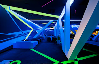
The Blackbox in Romania was designed by a group of architects known as parasite studio. The whole space has been designed with illuminated coloured lines cutting through all aspects of the nightclub. The name Blackbox came about as the nightclub is totally separate from the outside world. The design does not feature any windows at all, this allows the design to be fulfilled throughout the day. The existing structure of the space separates and cuts straight down the middle of the club generating a divide. But parasite studios incorporated this as part of the design and identity with the illuminated strips now flowing off from the structure.

Images sourced from http://abduzeedo.com/psychedelic-blackbox-romania

Melbourne Recital Centre ARM Architects


The Melbourne Recital Centre by ARM Architects is part of the transformation of Melbourne’s Southbank. The centre won the 2009 Victorian Architecture Medal for successfully winning top medals in all three categories of design. William Wardell Award for public architecture; the Marion Mahony Award for interior architecture and the Joseph Reed Award for urban design. The theatre has become one of the finest acoustically designed halls in the world. The facade of the centre along the Southbank has also become iconic for the design and its ability of changing pedestrian and traffic direction and patterns.

Images sourced from http://www.bustler.net/index.php/article/melbournes_iconic_theater_buildings_scoop_victorian_architecture_awards/

Exhale Pavilion Phu Hoang Office and Rachely Rotem Studio


The Exhale Pavilion is a fully interactive lighting instillation. It was designed in collaboration with phu hoang office and rachely rotem studios. The pavilion was designed as part of the art basel design Miami 2010 competition. The competition was aimed at creating ephemeral architecture along Miami beach front. The pavilion was designed as a stage for music and performance arts. The pavilion is 2322.576 m2 in size and is built up of seven miles of reflective, phosphorescent rope. The phosphorescent rope is charged by the wind from the sea, as the wind blows through the structure the structure moves and sways with the ropes lighting in the wind. Smaller sensors are placed at a lower level to allow someone to blow on the sensors briefly lighting up a small area.

Images sourced from http://design-milk.com/exhale-pavilion-by-phu-hoang-office-and-rachely-rotem-studio/ and http://www.designboom.com/weblog/cat/9/view/12407/phu-hoang-office-rachely-rotem-studio-exhale.html